Blank Map of South Korea
Printable map of South Korea with all 17 provinces and cities, in four versions — blank, labeled, colored and with cities. Download as SVG, PNG or PDF. Public-domain data, no watermark.
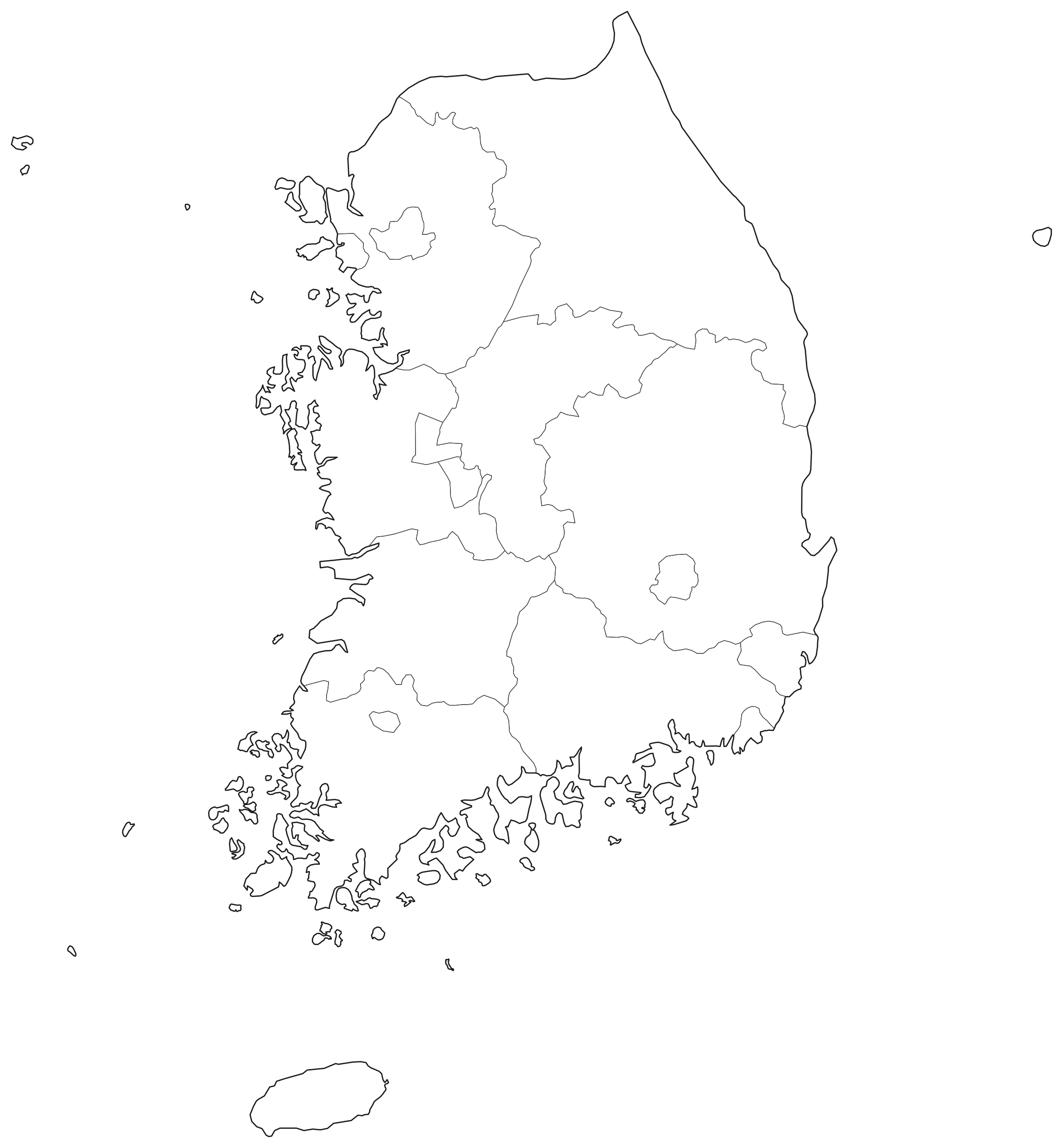
Outlines only — no labels, no fill.
SVG (vector)
Any size, editable in Inkscape, Illustrator or Figma.
PNG and PDF files are drawn in your browser at the size you pick; nothing is uploaded. No watermark, no sign-up.
South Korea at a glance
| Provinces and Cities on the map | 17 |
| Area of the shapes drawn | 98,742 km² · 38,124 mi² |
| Largest province by area | Gangwon — 19,204 km² |
| Smallest province by area | Gwangju — 133 km² |
| Places on the with-cities version | Seoul, Busan, Incheon, Daegu, Daejeon, Gwangju, Changwon, Suwon, Ulsan, Songnam |
Areas are computed here from the full-resolution Natural Earth shapes on a sphere and are approximate; official figures differ, especially where coastlines and islands are generalised. Cities are the largest by Natural Earth's metro population figure (pop_max); squares mark national capitals.
All 17 provinces and cities of South Korea
| Province | Area, km² (approx.) | Area, mi² (approx.) |
|---|---|---|
| Busan | 283 | 109 |
| Daegu | 467 | 180 |
| Daejeon | 367 | 142 |
| Gangwon | 19,204 | 7,415 |
| Gwangju | 133 | 51 |
| Gyeonggi | 10,227 | 3,949 |
| Incheon | 368 | 142 |
| Jeju | 1,873 | 723 |
| North Chungcheong | 7,675 | 2,963 |
| North Gyeongsang | 18,661 | 7,205 |
| North Jeolla | 8,266 | 3,192 |
| Sejong | 419 | 162 |
| Seoul | 579 | 224 |
| South Chungcheong | 7,531 | 2,908 |
| South Gyeongsang | 10,154 | 3,920 |
| South Jeolla | 11,497 | 4,439 |
| Ulsan | 1,038 | 401 |
Printing and using the map
- Pick a version with the tabs above the map. Blank is outlines only; Labeled names each province.
- For paper, choose PDF and your page size. Wide maps are placed on a landscape page automatically.
- Print at 100% or “Fit to page”. The PDF already leaves a half-inch margin.
- For slides or documents, a 1,200 or 2,400 px PNG is enough. For a poster, use the 4,800 px PNG or the SVG.
- To colour provinces and cities by your own data, open the SVG in a design program: each province is a separate path carrying its name.
About the boundaries
The shapes are Natural Earth's 1:10 million first-level administrative units (version 5.1), a public-domain dataset maintained by volunteers and the North American Cartographic Information Society. Where Natural Earth records a lower level of government than the one named here, its units are merged into the parent region, and names are given in common English forms.
The map uses an equal-area projection (Lambert azimuthal equal-area, centred on the map), so provinces and cities keep their true relative sizes. It is simplified to about the detail visible at 2223 × 2400 pixels, and coloured so that no two touching provinces and cities share a colour. The colours carry no meaning.
Limits: shorelines and small islands are generalised, very small provinces and cities may be hard to see at letter size, and the map shows administrative divisions only — no rivers, roads or terrain. It is for teaching, illustration and planning, not for legal, survey or navigation use.
Sources
- Natural Earth 1:10m Admin 1 – States, Provinces — public-domain boundaries, version 5.1
- Natural Earth 1:10m Populated Places — city locations and the population figures used to pick them
Source files downloaded October 18, 2026.
Frequently asked questions
How many provinces and cities are on this map of South Korea?
17. That is the number of shapes after the grouping described under "About the boundaries"; every one of them is listed in the table on this page.
Can I use these maps for free, including commercially?
Yes. The maps are drawn from public-domain boundary data (Natural Earth) and this site adds no restrictions: use them in worksheets, slides, videos, products and print without attribution.
Which file should I download for printing?
The PDF, sized for your paper. It holds a 200 dpi image scaled to fit inside a half-inch margin and turns landscape automatically for wide maps. The SVG is vector and prints sharp at any size from a design program.
Do the four versions line up with each other?
Yes. The labeled, colored and with-cities versions are the blank SVG with labels, fills or city markers added on top, so the borders are identical. Print the blank one as a quiz and the labeled one as the answer key.
Why are some labels shortened?
Labels are sized to fit inside each province. Where a name cannot fit even at the smallest readable size it is shortened with an ellipsis or replaced by its abbreviation. The full names are in the table below the map.
How accurate are the borders?
They come from Natural Earth, a public-domain dataset made for small-scale maps, simplified further to suit a 2223 × 2400 pixel drawing. Where borders are disputed, Natural Earth shows the line it considers in de facto use, which may differ from a particular government's position.
More blank maps
- United States
- Canada
- Mexico
- Brazil
- Argentina
- Colombia
- Chile
- Peru
- United Kingdom
- Ireland
- France
- Germany
- Italy
- Spain
- Portugal
- Netherlands
- Belgium
- Switzerland
- Austria
- Sweden
- Norway
- Finland
- Denmark
- Poland
- Czech Republic
- Hungary
- Romania
- Greece
- Turkey
- Ukraine
- Russia
- China
- India
- Japan
- Indonesia
- Philippines
- Vietnam
- Thailand
- Malaysia
- Singapore
- Pakistan
- Iran
- Iraq
- Saudi Arabia
- United Arab Emirates
- Israel
- South Africa
- Nigeria
- Egypt
- Australia
- New Zealand
- All 110 maps →